Nashville just made history. The Tennessee Titans dropped their long-awaited titans uniform reveal on March 12, 2026, and the reaction across the NFL world has been nothing short of electric. From a franchise-first white helmet to guitar strings stitched into the sleeve design, the Titans rolled out a brand-new identity that is equal parts bold statement and deeply personal tribute. And the internet has not stopped talking since.
This is the biggest rebrand the franchise has seen in nearly three decades. If you have been following along, now is the time to see exactly how it all came together.
Stay locked in as this story continues to develop — there is still more to come from Nashville.
What Set Everything in Motion
The buzz started building long before March 12. Billboards featuring three navy stars against a light blue background began appearing around Nashville, paired with the caption “A New Chapter Begins” and the date stamped beneath it. The franchise’s social media accounts followed with the same imagery, and fans knew immediately that something major was on the way.
The reveal date came nearly a month earlier than most observers expected, as recent NFL uniform redesigns had typically been unveiled in April ahead of the draft. The early timing sent a clear signal — the Titans were not waiting around. They wanted this rebrand front and center before free agency, before the draft, and before everything else.
1. The Helmet Nobody Saw Coming
The single detail that stopped fans cold was the helmet. The Titans’ new helmet will be white with a white face mask — a color combination never before seen in franchise history. After years of dark navy headwear, the shift to an all-white helmet represents one of the most dramatic single-piece changes any NFL franchise has made in recent memory.
The departure from the navy-heavy look is intentional. The brand overhaul centers around an even stronger embrace of “Titans Blue” as the primary color, reminiscent of the “Luv Ya Blue” era tied to the franchise’s Houston Oilers roots. Light blue is now the dominant force across the entire visual identity, not just an accent.
2. The Jersey Wordmark Change That Surprised Everyone
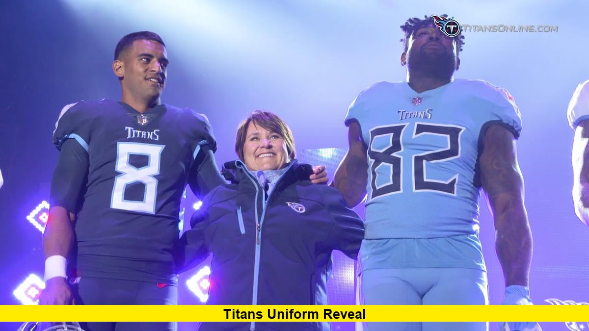
Beyond the helmet, the jersey wordmark quietly became one of the most talked-about details. The wordmark on the breastplate of the jersey now reads “Tennessee” — a change from “Titans,” which had been the standard since the team rebranded from the Tennessee Oilers in 1997.
That one shift carries enormous symbolic weight. The organization’s intention, according to details surrounding the rebrand, was to represent the entire state of Tennessee rather than centering the identity purely around Nashville or a mythological theme. It is a small detail with a large message, and fans noticed immediately.
3. The Guitar String Detail That Music City Loved
Among the specific design elements, none has drawn more universal praise than the sleeve striping. The new jerseys feature a red, white, navy, and light blue striping pattern that incorporates guitar strings — a direct nod to Nashville’s identity as Music City — along with three navy blue stars under the arms.
Those three stars pull directly from the Tennessee state flag and tie the uniform to something larger than the city alone. The guitar strings, meanwhile, have become the most-shared detail across social media. Fans who were on the fence about the broader redesign found themselves praising that specific touch as exactly the kind of local detail a franchise uniform should carry.
4. The End of the Flaming Thumbtack Era
The logo overhaul is just as significant as the uniform change. The Titans are officially moving away from the theme of Greek mythology — no more sword imagery on the shoulder pads, no more stripe down the middle of the helmet. The original logo, affectionately known by fans as the “flaming thumbtack,” had been in place since 1999.
Fan reactions have been decidedly mixed. Some supporters celebrated the removal of the flames, calling the previous design overdone and gimmicky, while others expressed disappointment, saying the new logo loses the unique character that made the Titans instantly recognizable. Reddit threads ran deep with nostalgia, while younger fans largely praised the cleaner, more streamlined direction.
5. Why This Rebrand Carries More Weight Than Just a New Look
This is not simply a jersey swap. The Titans have lost 28 games over the past two seasons. A new coaching staff under Robert Saleh is in place. Cam Ward is now under center as the franchise quarterback. A new stadium is on the horizon for 2027. Sports Illustrated The visual overhaul is the final piece of an organization that is drawing a hard line between what it was and what it intends to become.
The rebrand also arrives alongside the NFL’s new Rivalry Uniforms program, which means the Titans will receive a second brand-new uniform to wear during an AFC South rivalry game this season Sports Illustrated — adding yet another fresh look to what is already a landmark year for Tennessee football.
Team president Burke Nihill had telegraphed this direction months earlier, publicly stating there is a clear appetite to make light blue the team’s dominant on-field color. Hall of Fame quarterback Warren Moon described the incoming uniforms as very similar to the Houston Oilers throwbacks the franchise wore in 2023 and 2024 — designs that generated massive fan enthusiasm when they were first introduced.
The entire rebrand was unveiled to a packed house of season ticket holders at The Pinnacle in downtown Nashville, giving fans who have stuck with this team through difficult seasons the first in-person look at what the next chapter actually looks like.
What Happens Next
The jerseys are live, the logo is out, and the conversation is only accelerating. Jersey pre-orders are expected to follow quickly, and fans are already debating which uniform combination will hit hardest on game days. With a second new uniform arriving via the Rivalry program later this year and a brand-new stadium opening in 2027, Tennessee is in the middle of a full-scale transformation at every level. All eyes now turn to whether the new look translates into wins when Cam Ward takes the field this fall.
Drop your thoughts in the comments — love the new look or miss the old one? Tennessee fans want to hear what you think.